Written by Simon Geraghty.
We have previously written about our approach to responsive design and here we showcase some of our recent work. We also look to give an insight our approach.
Mashable wrote an article predicting that 2013 would be the year of responsive design. Responsive web design is where a website responds to the screen size of a device by simply reorganizing the layout of its content. For example, a site might have three columns when viewed on your laptop, but only a single column on your mobile phone.
At DotDash we want to ensure all of the sites we develop this year give a great user experience and a consistent look and feel when viewed across any screen size or device. Ironically, our own site is not mobile ready, but this is in the works as we speak!
Recent Responsive Web Design 1: RHA Gallery
Client Objectives:
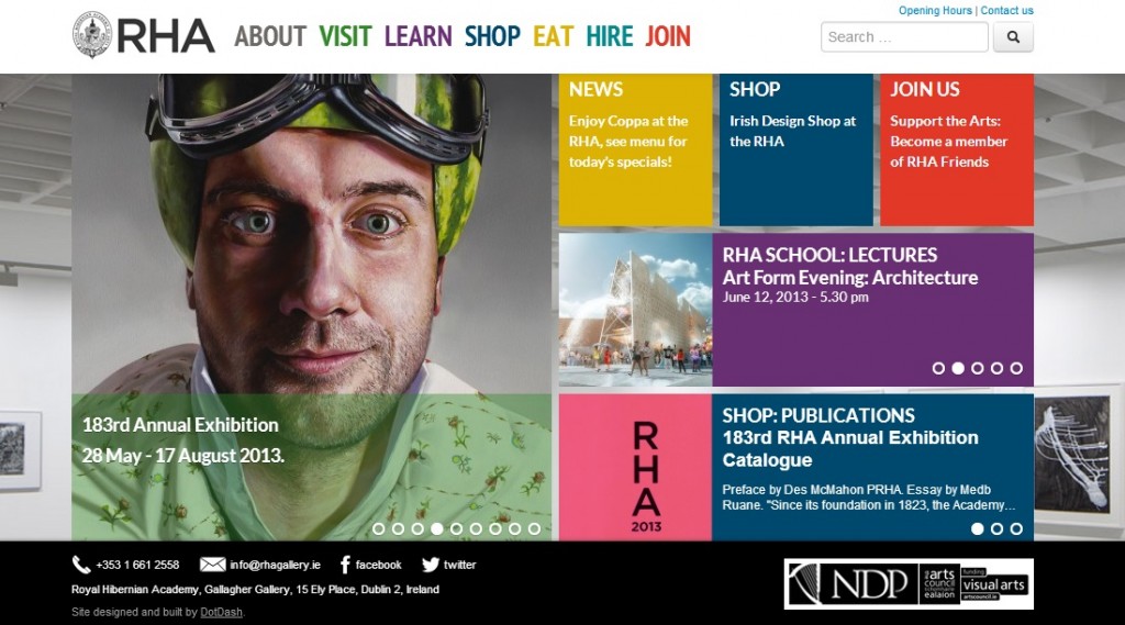
The RHA Gallery came to us looking to update their existing static website to one that was more visual and vibrant. They were also looking for a Content Management System (CMS) that they could manage themselves.
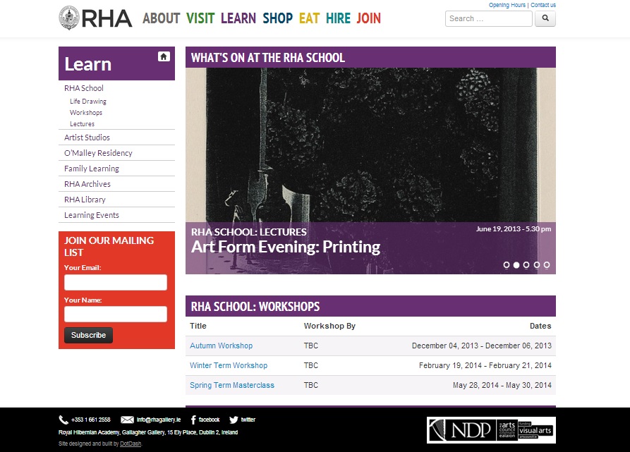
They wanted a design that was accessible across a range of devices and one where joining the RHA and their mailing list was front and centre.
Design solutions and features:
- A design constraint they presented us with was the need for all the content on the home screen to all feature above the fold.
- The new homepage design took inspiration from the Moma.org website but we feel the new RHA site delivers more content and information to its visitors.
- The artwork on display in the gallery is the key site content and we wanted this to be the main focus on the homepage.
- We made use of one of the galleries own strong images as a background to showcase the gallery itself.
- We also used multiple scollers on the homepage, three in all, to make the site appear more dynamic. The main scroller is automated while the other two scroll when clicked.
- The client wanted action oriented page headings (Visit, Learn, Hire, Shop, Join) taking their lead from both Moma.org and Asos.com sites and these really add to the dynamism of the new site.
- The site header stays with you as you scroll down any page.
The RHA’s sponsors are all displayed on the page footer and subscribing to the mailing list is prominently displayed on all the internal pages. Other features include an:
The site launch coincided with a great write up of the RHA in the Irish Times which certainly help to drive traffic on day one!
Recent Responsive Web Design 2: OvationDMC
Client Objectives:
Ovation Global DMC is a network of Destination Management Companies that is active in over a 100 destinations around the world. We have worked with them and their sister company, MCI Group (no not that MCI), on a number of projects, including redesigning some of their newsletters. Ovation approached us looking to improve the overall user experience and layout of information on their website.
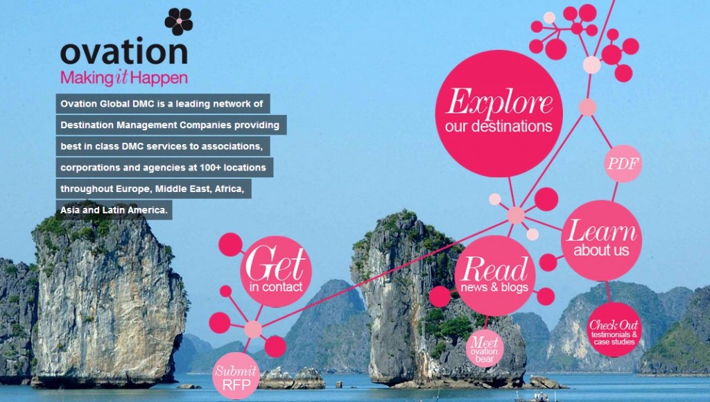
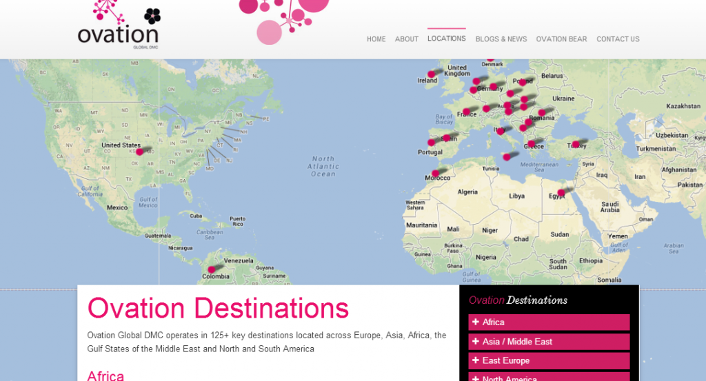
Our client wanted visitors to their site to be able to see the locations they are active in, get in contact and to submit an RFP easily.
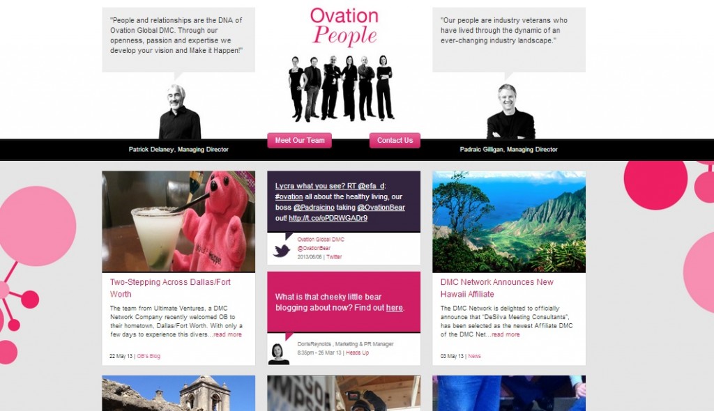
They also wanted to have their brand identity, made up of their people, destinations, the Ovation Bear, and their social content to feature prominently in their new responsive web design.
 Design solutions and features:
- The new homepage design uses Ovation’s gorgeous destination photography to make an impact. We also used parallax scrolling on the homepage, this is where the objects in the foreground and background appear to move at different speeds.
- The umbelliferous device, or flower motif, a key brand element features as a navigational element on the homepage. The navigation reverts to a traditional header for the rest of the site.
- The site also makes use of their strong team portraits on several pages.
- The Ovation team liked the use of a masonry style design used on the Dublin Town and Wolff Olins websites, which in turn is driven by the Windows 8 look and feel.
- We mimicked a masonry design but tidied up the information into a grid that displays their numerous blogs, tweets and shout outs (where they have the ability to highlight one of their articles or some company news).
- Other features on the site include a Google Map showing their global destinations, the ability to submit an RFP, their newsletters and blog content.
Recent Responsive Web Design 3: Padraicino.com
Client Objectives
Padraic Gilligan, the Vice President of Ovation Global, is an avid blogger in his sector, the Meetings, Incentives, Conferences and Events (MICE) sector. He approached us looking for a new identity for his personal blog.
He also wanted a site that organised his content by topic making them easily searchable and where they could be easily shared across various social media platforms.
Design solutions and features:
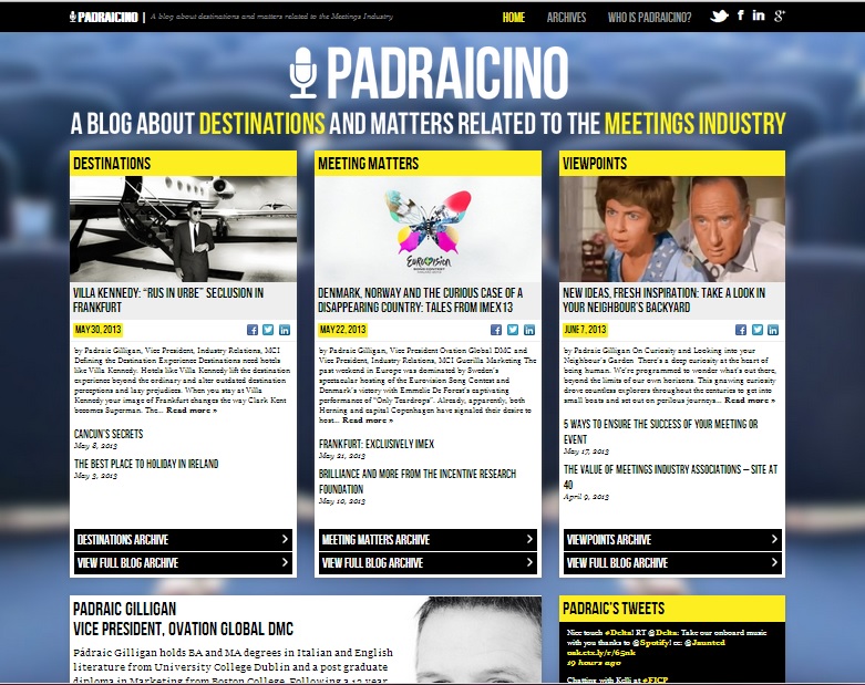
- We created a new brand for Padraic using the microphone as a simple signifier for the space that Padraic operates in.
- The image used as the homepage backdrop serves as great visual short hand for the site content itself. It also works well as a motif for a blogger addressing an audience, or is that just a painful elaboration of the obvious?
- Articles on the site can be shared straight from the homepage across Facebook, LinkedIn and Twitter.
- The site is a fully responsive web design and built using WordPress.
Let us know if we can help you with your new website or redesign, mail us today at [email protected].
