Written by Simon Geraghty.
Today we’re taking a looking at free infographic tools for your content marketing activity. But what’s an infographic? The word itself is the result of a collision of the words ‘information’ and ‘graphic’, and is a graphic image that uses two or more of the following elements:
- words
- graphics
- statistics
They are a handy visual representation of a story and a really useful tool, particularly in the era of byte-sized information and the competition for ever diminishing attention spans.
The uses and applications of the infographic vary from statistical information about usage levels of public transport or alcohol consumption to those comparing the special powers of your favourite super heroes. They are also increasingly being used for CVs and cover letters in order to make a lasting impression in a highly competitive job market.
The main benefits of infographics are:
- Quick communication of information.
- Representation of complex information.
- Visual appeal.
We have often been asked by clients how easy these are to do. With some great free infographic tools out there that allow you to make your own infographics now anyone can get their story across more creatively.
We were eager to see how easy is it to produce something appealing, without anyone with a graphic design background being involved, and went about test driving the following tools:
- Piktochart
- Easel.ly and
- Infogr.am
- Prezi
First up Infogr.am
What it says on the tin: Data is fun again
Number of templates: 6 free
Infogr.am is a simple infographic tool. You can import your data and use it to create an impressive infographic or chart fairly quickly.
How to select your chosen template wasn’t immediately obvious and with no prompts forthcoming we got there through a process of trial and error until we got it right. Infogr.am does not have the option to use any supplied images which is a big inconvenience as you will need to make or find your own. Once you figure out how to use it, it is relatively quick allowing you to create an infographic in a matter of minutes.
Usability score: 6/10. With a lack of supplied images this is a big disadvantage making it feel basic.
Next up Piktochart
What it says on the tin: Make information beautiful
Number of Templates: 6 free
Piktochart uses drag and drop functionality making it very intuitive to use. After a few clicks you can have an impressive infographic complete with graphs and graphics as well as the option to upload your own images. You can play around with themes that best suit your data and choose from a range of fonts and colour schemes. Once finished you can easily download your infographic and embed it on your website.
The tool lacks images to choose from but I think they could be better looking so it is in keeping with the rest of the graphics and maybe the grouping of images by category might be beneficial.
Usability score: 9/10. Piktochart is easy to use and offers a good range of themes, images and functionality. A good all rounder.
Over to Easel.ly (hope you all got that one!)
What is says on the tin: Create and share visual ideas online
Number of Templates: 15
Easel.ly also uses a drag and drop feature that is simple yet effective, it has a basic but pleasing interface and solid functionality. The great thing about easel.ly is that you can get to the good stuff and start making infographics quickly without having to watch several tutorials, although they have a nifty one that gets you up to speed. There’s a good range of templates or themes to start with, so you are sure to find something that fits.
A problem we encountered at the registration and logging in stages. Once registered for an account you don’t get an email confirming your registration details or even a message on screen to say you are registered. This can lead to setting up multiple times and even then logging in can be confusing.
Usability score: 7/10. Loading can be sticky and even accessing your account can at times be difficult. On the plus side it is intuitive and easy to start making infographics almost instantly.
Last but not least Prezi
What is says on the tin: A presentation tool that helps you organize and share your ideas.
Number of Templates: 20
Not strictly an infographic tool, it’s niche in the market is as an alternative to Powerpoint or Keynote. You can get a free account, or pay a fee for an account that allows you to set your work to private. The key design feature of Prezi is a mind mapping tool. There are a good variety of templates, very helpful tutorial videos and a great gallery for inspiration. With an ever expanding range of diagram types and features it is one to watch.
Limitations are the number of fonts available and formatting, such as the ability to create numbered lists. You need to bring you images and a design mind to the table. Exporting your image at the end of the process requires some photoshoppery.
Usability score: 7/10. Offers a good variety of templates, helpful tutorials. But is tricky to export a high res image file.
Overall
Our favourite straight-up infographic tool was Piktochart for its sheer ease of use, and ability to make information beautiful.
When it comes to making infographics you want to get stuck in, not have to fool around figuring out how to make them, and focus your energy on making them look good. The more you use the tools the more confident you get at creating infographics.
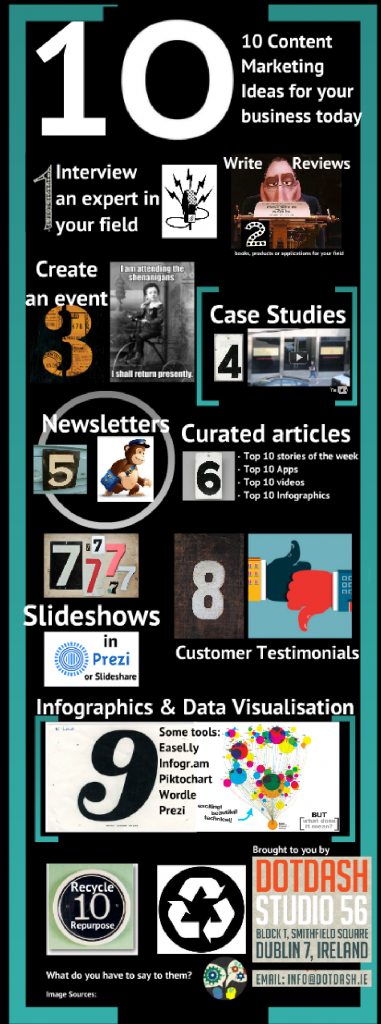
We used Prezi for our first pass below, so if a picture speaks a thousand words, what tools are you using to create yours? Check out our results below and share your thoughts!

