Written by Simon Geraghty.
We were recently asked by a client to come up with a briefing document to help their teams get us the right data so we can design better infographics for the orgnisation. Never one to look a gift horse in the mouth, we decided that we could create two pieces of content from one, so here are our top 10 tips for designing better infographics.
 1. Your Fact finding mission:
Gather your data; look to get your hands around all the pertinent facts and raw data for your business area. What in-house data do you have? What third party figures do you have? What is the reputation of each source?
2. Study your data in detail: don’t skim!
Start with your executive summary by all means, but some real nuggets will be contained in the charts and tables that didn’t make it into the summary and final report.

3. Rank your data:
Like any good press release, an infographic requires a hierarchy of information. What facts jump off the page from your data? What facts support your key finding? Are there other salient facts? Your designer might decide that they cannot fit everything in, what is the minimum amount of information you want to get across?
4. Send your designer the supporting reports:
Your designer will be seeing this information from a fresh perspective and they might spot something you may have missed. Sending them over the original report, or press release, gives them a better idea of the full story and context.
 5. Put your most newsworthy facts at the top:
The new attention economy is a competitive space, you need to grab attention quickly. So what is the narrative? What is the common thread in the facts and findings? Good infographics tell a new and compelling story. One that will stand out in the market. What not to do – show all the data you have on a subject and rely on the reader to make sense of it all him or herself. The above is sourced from The Guardian’s interesting article on ‘16 Useless Infographics‘.
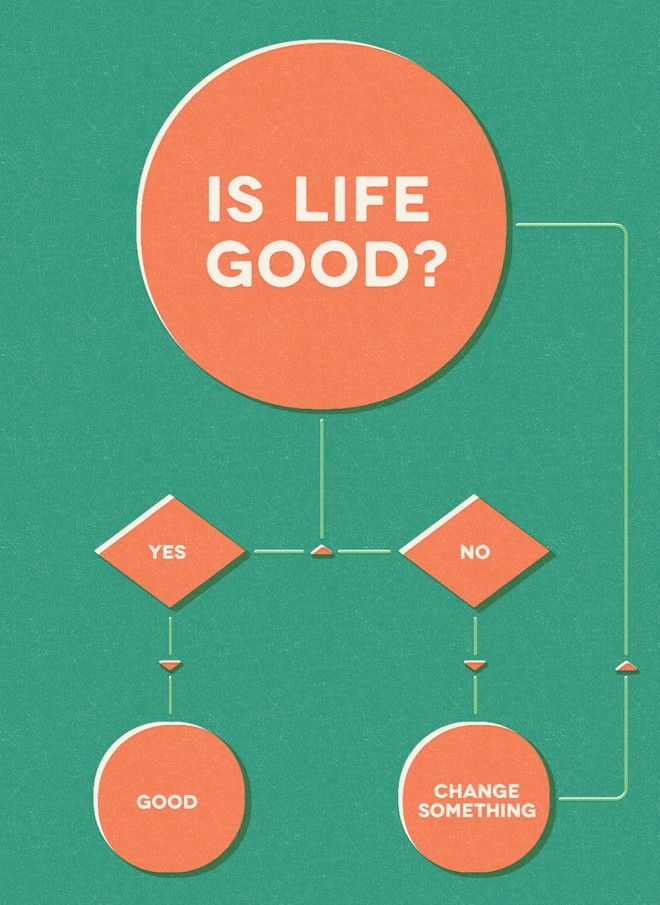
 6. Show, don’t tell:
Once you’ve established the key facts and their relationship with each other we want to present a concise narrative. You should not look to throw everything you know about a subject at this infographic. The aim is to tell a clear and compelling story about a facet of your business or sector. See ‘Visual Compendium of Cameras’ above.
7. Don’t repeat yourself:
Don’t repeat yourself!

8. Is it readable at a glance?
Data is scanned rather than read in detail, hence the growth of this format. Do you have enough clear facts and trends to illustrate in this graphic? You shouldn’t be making the reader work to find the story in the infographic, it should jump off the page straight away. The ‘Planets to Scale’ graphic above imparts its facts in a moment.
9. Accuracy (and recency) of your data:
Before setting out on this project, ask do I have the final signed off figures in my possession? Also, make sure the data you supply is up to date and note how often it may have been published elsewhere? Although where the research painstakingly tracks changes over a period of 50 years data recency becomes a moot point, see the gorgeous ’50 Years of Visionary Sci-Fi Computer Interfaces’ at the foot of this article.
10. Remember this is not a press ad:
Brand guidelines do not apply, other than clear use of your logo. You are creating content that puts a set of facts and figures into the world, the more outward looking these are the more likely it is to be picked up by journalists.
Writing out this list of 10 tips for designing better infographics gave us an excuse to show some of our favourite infographics, data visualisations and flow charts. We also have a curated list on a board over on Pinterest. For more on getting an inographic designed by DotDash just mail us at [email protected].