OUR WORK
SOMETIMES THE ANSWERS ARE SIMPLE AND THE QUESTION IS COMPLICATED * *DR. SEUSS
We deliver beautifully designed work, that is well built and supported by strong account management.
SOME FOLK WE'VE WORKED WITH...

SELECTED
WORK
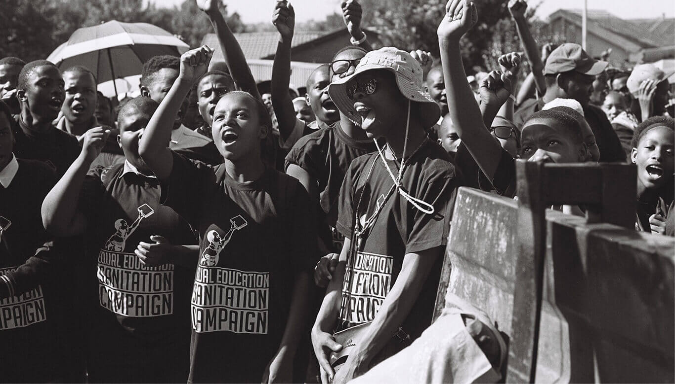

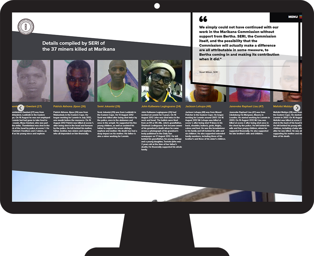
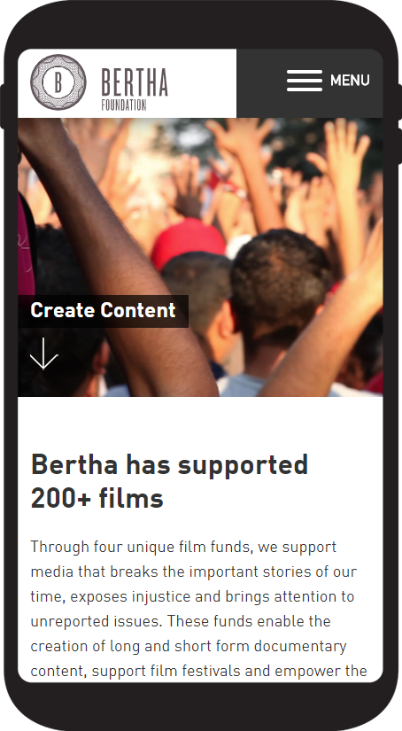
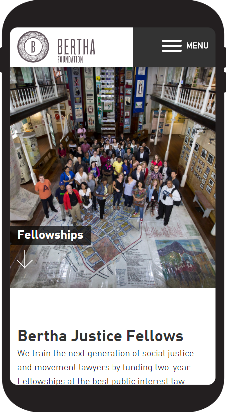
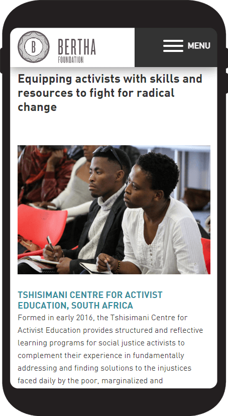
BERTHA FOUNDATION
The Bertha Foundation is based in New York and London. We were hired based on our clear understanding of their brief, their desired design outcomes, as well as the cultural alignment between each business.
Our work with the client was two-pronged, we redesigned their website and also designed two mixed-media presentations for their "Impact Reports":
- Justice for Victims of State Violence
- An injury to one...
For the overall website design project the key areas of focus were:
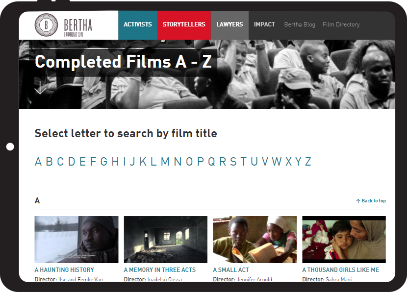
- To hero the dynamic multi-media content that reflected the breadth of work the organisation undertakes our work
- To equally represent the three disciplines across the site (Activism, Storytelling, Lawyers)
- To develop a visual shorthand that would brand each discipline within the organisation but also show how the three are intrinsically linked.
The Impact reports themselves involved a massive content audit, editorial work as well as design and development. We drew inspiration from websites for the Life of Pi, long form articles on the New York Times and a documentary website developed by National Geographic.
At the ideation stage we developed a concept for the animated video that introduces the Impact reports section and shows how each discipline works together for their organisation. This video was designed and animated by our team.
The concept of the map on the l awyers page came up as a feature during the Prototyping stage of the project. This was treated as a mini project within the whole project.
Key to the whole project was making use of the rich multi media material in their organisation, in particular to bring video to life across the site. As part of the site evolution, post launch, we did additional coding work on the The Film directory database to make this fully editable by the client.
Our work with this client continues as we evolve the site and they develop more content.
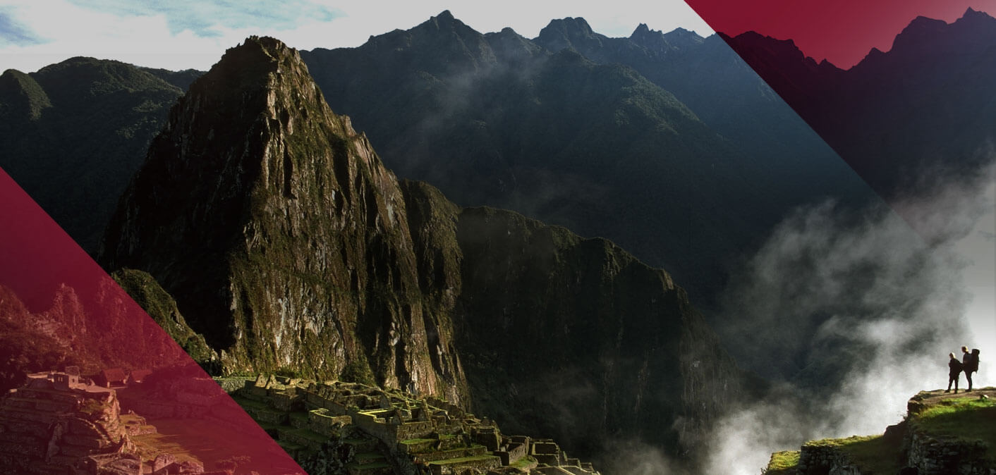

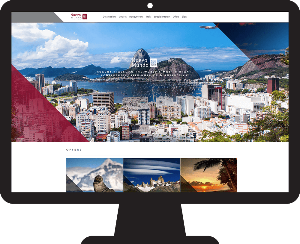
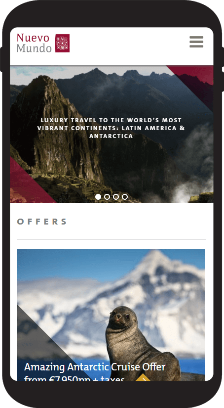
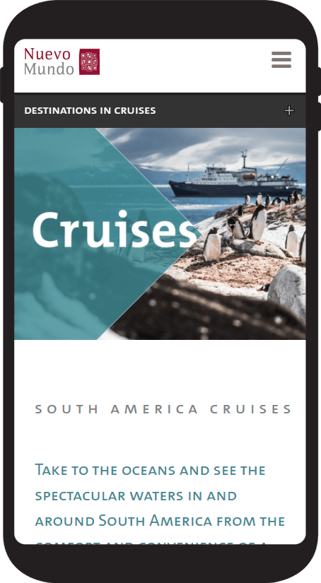
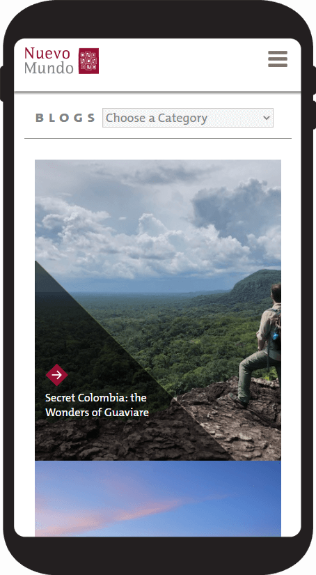
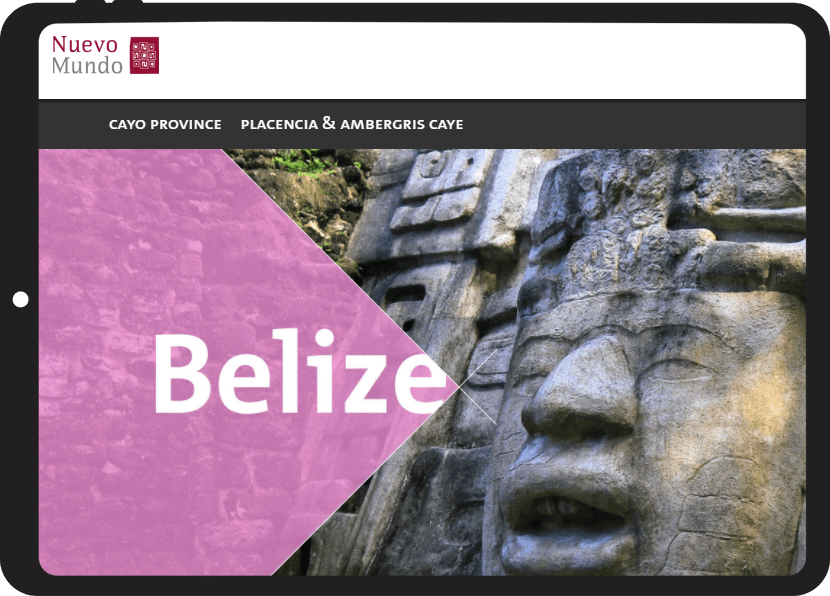
NUEVO MUNDO
Nuevo Mundo sell highly aspirational, once in a lifetime, trips to South America to a discerning audience. They are part of the go hop group in Ireland. They offer a travel product based on high quality, experiential travel, and trusted expertise.
READ MOREFor this design project the key areas of focus for the client were:
- To present Nuevo Mundo as a highly aspirational brand
- To showcase South America
- To drive the call to action of either downloading a brochure or ordering a quote The client also had strong brand guidelines that needed to be part of the new design.
During the Discovery phase it emerged that each itinerary sold is bespoke to the end user. This a consultative sale usually carried out over the phone, email or in person. To drive this the CTA’s are prominently displayed throughout the site.
At the ideation stage we decided to use large format images to hero the amazing library of destination photography at their disposal to sell the travel experience.
To facilitate ease of use we gave the user multiple ways of navigating the site. During the prototype phase we iterated modes of navigation, particularly for mobile.
The redesign showcases the bespoke, hand picked nature of each itinerary. With the aim of firing the imagination of the end user.
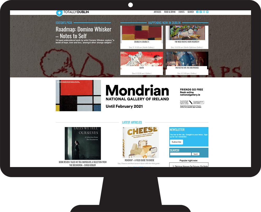
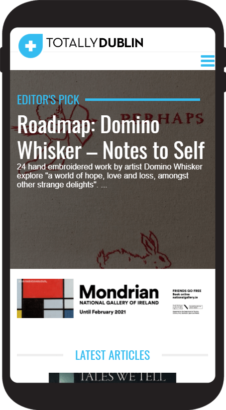
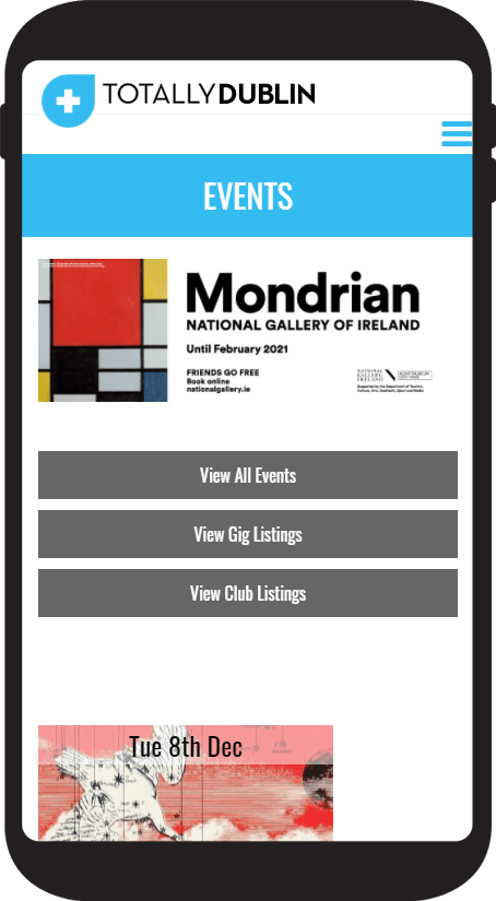
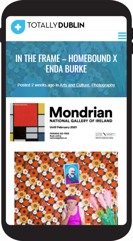
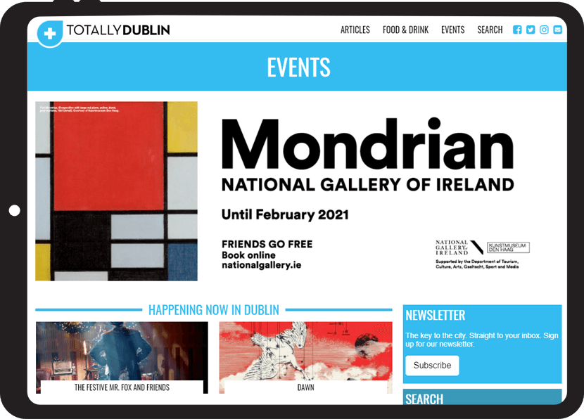
TOTALLY DUBLIN
HKM publishing is a client we’ve worked with for 6 years in both the Swedish and Irish markets. Totally Orebro and Totally Stockholm also follow the same design template as Totally Dublin.
We are now on the 3rd design iteration of their websites.
READ MOREFor the latest redesign the key areas of focus for the client were:
- To simplify the content categories for the magazine
- To ensure a mobile first reader experience and future proof our design
- To standardise the ad formats across the group (with an emphasis on mobile first formats)
Our team really benefitted from the fact that the design aesthetic in the magazines is so clearly defined. At the ideation stage we also took our design cues from publishers in the UK, Ireland and Sweden, all of whom had moved to a mobile first product.
During the prototyping stage we worked on multiple iterations of the image thumbnails and titling on mobile, how the editors picks could be automated and how the ads would display across various content lengths.
Key to all of our design work was a mobile first user experience, with shorter dwell time, content and ease of access to cultural information for Dublin.
TESIMONIALS
SOME KIND WORDS
When you find a partner that’s able to capture in visual precision those elusive and indistinct creative impulses that ramble around in the forest of your mind then treasure them dearly because they are as rare as hen’s teeth.
PADRAIC GILLIGAN
MANAGING PARTNER, SOOLNUA
Working with Simon, Conor and Trevor was pretty seamless which not only meant we got what we wanted from the site but also kept things on budget with a clear plan from the outset. Needless to say I’d have no qualms about recommending to a friend. Thanks guys!
MICHAEL HARRINGTON
FOUNDER AND MANAGING DIRECTOR, NUEVO MUNDO
Simon’s guidance and knowledge of all things web, content, trends and technology really helped. He guided us but at the same time it was a collaborative process, which I is think is important.
TARA DOYLE
SALES & MARKETING DIRECTOR, supportIT
Simon and his team have been instrumental in turning Stint Ireland from an idea into a reality with the website, and ongoing digital marketing strategy and support.
MELANIE MCDOWELL
FOUNDER AND MANAGING DIRECTOR, SLINT IRELAND