Written by Simon Geraghty.
We have well and truly crossed the half way point in the year and instead seem to be hurtling towards its conclusion. How did that happen? There’s something about the cycle of school holidays that quickens the pace of time. My little ones are back to school this week!
So as the evening start to draw in we’ve decided to take stock of the predicted web design trends in 2015 and see which ones are most evident this year, both in our own work and sites designed by third parties.
1. Large Images:
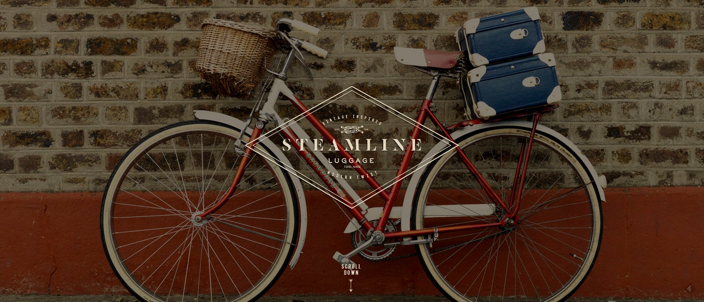
Examples: jump!, Starcom, Treat Deli & Steamline Luggage
This trend is driven in part by faster broadband speeds and businesses looking to move beyond the standard stock images that proliferate many of their competitors websites.
This layout works very well when used alongside long form written content such as articles, blogs or in-depth case studies. The use of large images has also been driven by the design of popular story telling platform Medium, which has influenced the designs of Quartz, Salt, Fast Company and even Facebook’s redesign of it’s Notes feature.
Best practice here is to commission your own photography. We have worked several times with the successful and award winning Erin Quinn on several of our own projects that have required photography. For jump!’s website her image is the centre piece on the ‘contact‘ section. For our website for Treat Gift Shop & Deli she took all the exterior and interior shots used throughout the site to capture the spirit of the store. Steamline Luggage commissioned their own photographer for the gorgeous shot on their landing page, above.

2. Rich Content / Background video:
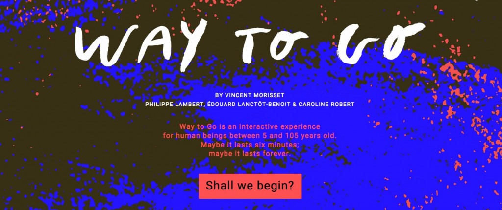
Examples: Sool Nua, Jam Media, Starcom & A Way to Go
Using a short looped video on your homepage can quickly set the mood or demonstrate your product/ services to the user when they land on your site. For the Sool Nua design we sourced footage of Shanghai, as a company in the meetings and events business this hypnotic night-time footage subtly helps them set the context that they are experts in the events, conferences and meetings sector.
With Jam Media, a multi-award winning animation studio their showreel beautifully showcases their work. While another recent client, Starcom commissioned their own animated ‘showreel’ video to demonstrate who they work with and their overall ethos.
A site that really pushes the boat out for an amazing immersive rich content experience is ‘A Way to Go‘. Produced by the studio AATOAA, who were also behind Arcade Fire’s award-winning Reflektor video, as the site says about your visit “maybe it lasts six minutes, maybe its lasts forever!”

3. Scrolling sites or long form:
Examples: Starcom, Sool Nua, RUA RED & jump!
First brought to fame by the Snowfall story in the New York Times, while the Guardian and National Geographic have amply added to the canon. The format lends itself to a good mixture of content types (photography, video, written content and audio clips). The trends noted in points 1 & 2 above also compliment the one page style layout.
These sites rely strongly on art of story telling and in an era of diminished attention spans it is important to ensure you invest time and resource in your content to tell stories that are relevant to your audience and they will share them accordingly.
Typically all the websites content appears on one page, however, there are variations on this whereby the homepage is presented as a coherent one page site, but more detail is available elsewhere on the site for visitors to read more about your company (whether that be your blog, case studies, or service pages).
These designs often make use of parallax scrolling as the user navigates down the page; using scrolling to navigate also takes into account how we navigate on mobiles and tablets (using a swiping action).
As this trend catches on it is important to innovate to stand out from the rest of the pack.

4. Large Typography:
Examples: RGM, Doamaral & Readymag
A counter trend to the use of rich background content or large format images is a shift towards sites that have no background images and the use of simple typographic design on landing pages instead. The thinking here being that if everyone’s using video and or large images on their websites then to stand out you have to use other means of to do this!
Using large typography gives you a chance to use your text to deliver the impact rather than images or video. Getting a succinct tagline is important to make a strong tatement, again investing the time and resource in great copy writing is essential.
Invest in unique fonts from sites such as My Fonts or Typekit to really help your content stand out. While we’ve dabbled in this with the intro sections on the jump! and Starcom websites but we’ve referenced some sites above that have really pushed the boat out here.
Unsurprisingly, Andre Do Amaral is a designer himself, and his site couples large imagery with a large clean type. Readymag makes beautiful use of a short lopped video as well and a chapterised one page style layout. Finally, the Riga Ghetto Museum in Latvia beautifully weaves together archive photographs, animation and rich media to tell the story of Jewish life, the ghetto and the Holocaust in Latvia.

5. Fix width centered site layout
Examples: jump!, Jam Media, RUA RED.
Mobile first certainly but it is equally important to ensure a site renders well on larger higher resolution screens: Web designers are rightly focussed on how content appears on the smallest screens and tablets. This can be tackled by either going fixed width and centering the site adding margins on larger screens or else presenting the site slightly differently above a certain resolution. Particularly where a masonry effect has been used.
Key Web Design Trends in 2015: Simplify
So we’ve crossed 2015’s rubicon and looked at some web design trends in 2015, the team at Coastal Creative Reprographics produced a good infographic summarising the web design trends that they predicted for 2015.
Key to making all of the above work is that your site loads quickly. This may also mean checking your website hosting and its performance using pingdom’s free speed test tool.
All of these trends still need to be underpinned by some clear design principles, key is keeping it simple, good design is often using as little design as possible.
Why not drop us a line at [email protected] and we can do a free consultation on your website and look at how it is performing?